Friday, 24 April 2015
Tuesday, 14 April 2015
Monday, 13 April 2015
Sunday, 12 April 2015
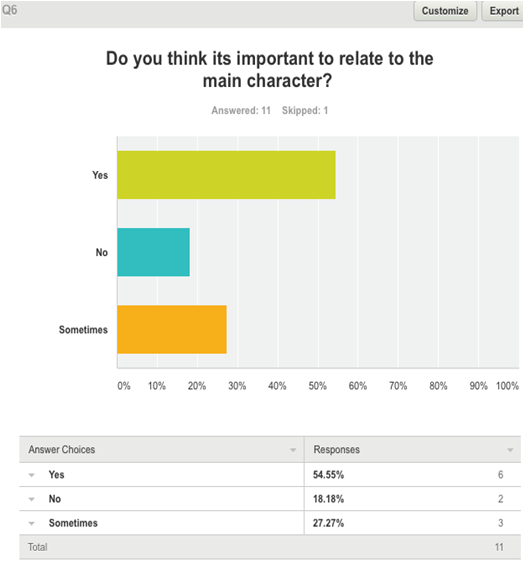
Looking back at your preliminary task, what do you feel you have learnt in the progression from it to the full product?
Looking back at the preliminary task i was set at the beginning of the year, i can see how much progress i have made to my editing and camera work, however also areas involving sound and mise-en-scene. The overall standard of my work has risen through the creativity and accuracy that has been developed.


When it came to constructing my own opening sequence, i felt more prepared and experienced in using the equipment. I also had time to plan and develop my ideas meaning the footage i filmed was more creative and showed a larger variety of shots.


To conclude, the progress from my preliminary material to my final draft of my opening sequence is huge. I have learnt a range of more complex editing techniques and also a large number of diverse camera movements. The level of my creativity has increased due to my growing confidence in the usage of the equipment helping to overall improve the level and standard of my production work.
How does your media product represent particular social groups?
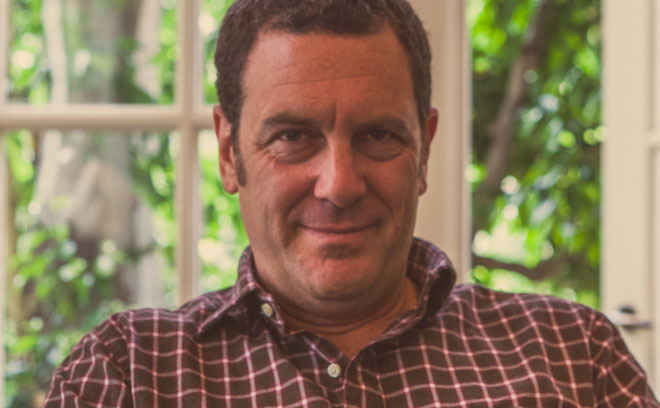
The key character featured within our opening sequence is Huge Green. When deciding what our main character should include in areas such as personality and looks, we wanted to conform to the conventions of many thriller detectives.
This decision is clearly shown through
the visual choices we made such as costume. For example, our character Huge
Green appears in the opening wearing a long black trench coat, which is known
as one of the many symbolic things about a detective, helping the audience to
immediately identify his characters occupation. Another item of costume is a
white, V-neck collared shirt which is paired with black, smart trousers and
black leather shoes.


This style of costume is very similar to
the one that appears on the character of Sherlock Holmes in the BBC program.
Actor Benedict Cumberbatch wears a long black trench coat, similar to Green and
pairs it with a scarf. This symbolic coat also is featured on another range of
detective characters such as Sam Spade in 1941 film The Maltese Falcon.

The role within our sequences of the main character, Huge Green, is to be a lone detective who loses his partner. The audience are supposed to empathize with Green and see his determination to solve every case. The audience should also be able to see that Green is a little different, making him a more interesting character. Therefore we made him older in age to signify his experience as a detective but also that he is a serious character which will not allow the audience to connect with Green to much as the genre is a thriller and therefore the audience's main attention should be focused on the narrative and not the characters, Green having a strong and serious personality will enforce this.

The role of Green within our opening sequence shares a similarity to that of Brad Pitt's character, detective David Mills, in the 1995 thriller Se7en. Mill's is a detective who is transferred to a large city to work on a case about a psychopath. This connects to our Green through the shared detective occupation but also to the idea of being the lone detective. Later on in Se7en, Mill's wife is murdered by the killer he's hunting which in turn is the same narrative featured in our sequence. Both detectives lose a companion to the criminal their searching for leaving them alone and lonely.

My opening sequence portrays Green personality as being hard working and independent through the office footage. The aim of Green was to make him appear intelligent and alert. He is represented as being aware of his surroundings and himself. Green is passionate about his job and is extremely good at it. Green also comes across as being strong minded and liking his own company.
These characteristics are relatively too
similar to that of the character detective Rustin Cohle, featured in True
Detectives and portrayed by Matthew McConaughey. Cohle
has also suffered a loss, however of his daughter, and suffers the same as
Green with the loss of his partner. Both characters are independent and head
strong with Cohle keeping himself to himself. Both characters suffer from the stress of their detective occupation which is represented through Green sometimes appearing
worn out and tired.

Although there are many similarities between other detective characters portrayed in a variety of media in terms of appearance, costume, role in film and personality. There are also a large number of differences when it comes to the character of our opening sequence, Huge Green.
One of the vital main differences is that all the previously mentioned
characters. Despite their
personality traits of being independent people, they all have a
supporter/partner. This is a difference within my opening as Green's partner is
the one who died alternatively to having someone who helps him solve the
mystery. Sherlock Holmes has Doctor Watson, David Mills has
Detective Somerset and Rustin Cohle's partner is Martin Hart.

.jpg)

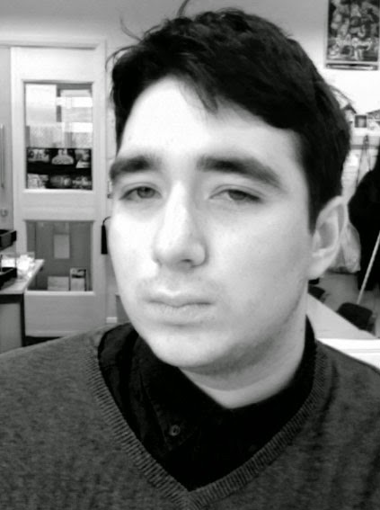
The other character featured within my opening sequence is that of the anonymous antagonist. Within the planning stages of my opening we decided the character represented would be featured in a range of extreme close ups in order to help keep the mystery of their identity but also to help the suspense we wished to create. However, the antagonist was represented in these shots completing actions such as cutting up photos and organizing chains. Due to the abnormality of the footage from everyday life we decided that our mystery antagonist should suffer from a mental illness resulting in his character being related to a psychopath - a common conventional character for an antagonist within a thriller.
Another antagonist who shares a similar characterization as my own antagonist is Norman Bates featured as a psychopath in the 1960's film Psycho, directed by Alfred Hitchcock. Bates visual character is young and good looking with Hitchcock wanting him to be relatable, resulting in his character being represented as 'the boy next door'.
The antagonist represented within our opening sequence is of similar characterization. Although he is visually not seen in the opening, he is mid twenty's and attractive. I wanted the character to be someone the audience could like meaning the twist that he was actually the killer even more surprising. Therefore, in order for the audience to empathize and connect to the character i wanted to make him visually appropriate, however due to the use of close ups the audience also need to sympathize with the character and see his struggles as he struggles with the demons in his head, regarded as his mental illness.

Wednesday, 8 April 2015
Who would be the audience for your media product?


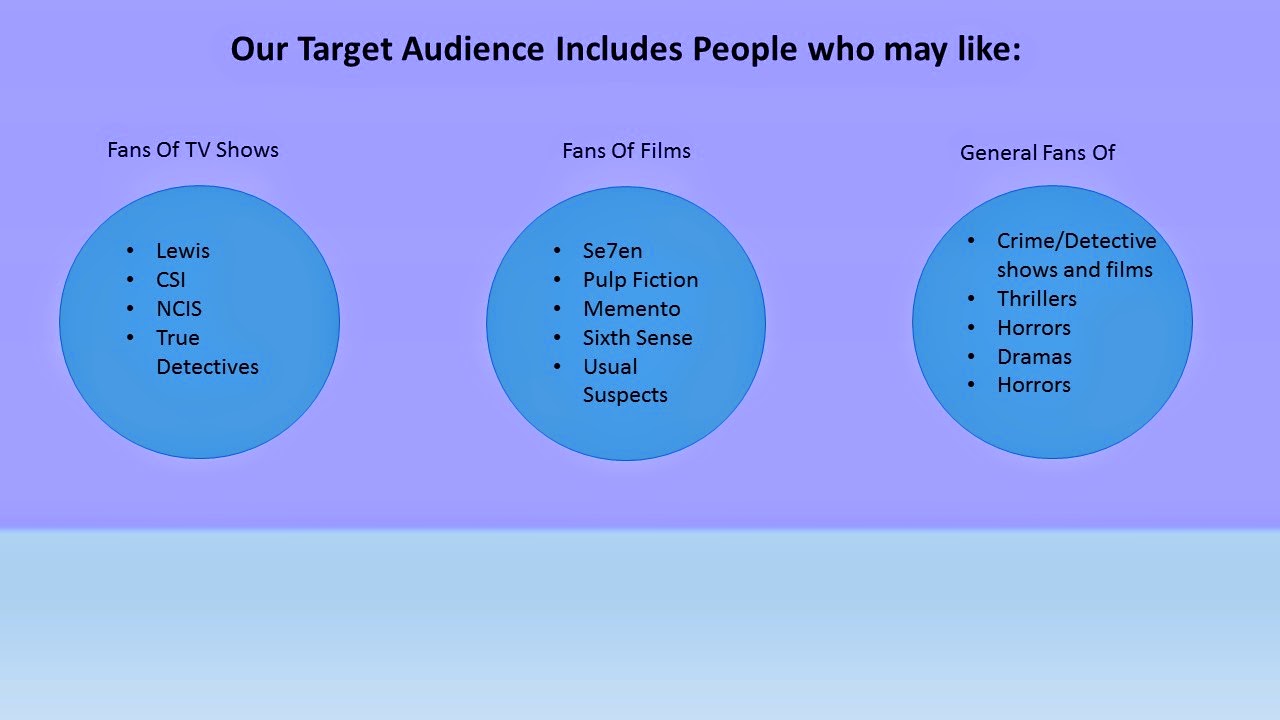
 |
| Evidenced research representing our demographic target audience should be males over 25 making them relatable to the protagonist. |
 |
| Researched evidence from our survey representing typical conventions our target audience want to see within a thriller. All conventions are shared with those that appear in other digital media's including Lewis for mystery and detectives in Se7en. |


Thursday, 26 March 2015
Sunday, 22 March 2015
Tuesday, 17 March 2015
Monday, 16 March 2015
Opening Sequence Name - The Unit
Creating the title that would appear on our opening sequence was important as we didn't want our opening to feel to much like a television program rather then a film. Because of this we decided we would stick to our original titles and use a typewriter font and red and white colouring for our title rather then the more detailed one below, as this would fit conventions more and make our opening feel like a film as this was specified in the brief.

Monday, 2 March 2015
Analysis of previous AS Media Prodjects 2013/2014
When watching the previous examples of submitted work, I considered the mark scheme and what was required from the pieces of work. Because of this I focused on the following key aspects:
1. Materials being appropriate for the intended target audience and task
2. Using titles appropriately for the chosen genre
3. Using sound with images and editing appropriately for the task set
4. Shooting material appropriate for the task, including controlled camera work, accurate framing, variety of shot distances and attention to mise-en-scene
5. Using editing so meaning is apparent to the viewer and making selective and appropriate use of shot transitions and other effects
Roses Are Red
The first clip that I analysed was called Roses Are Red and was intended for a female democratic target audience aged under 25. The genre in my opinion was a drama/Chick Flick as it started by featuring a teenage girl who the audience see going through her daily routine of getting ready such as putting on make-up.
Good aspects within the clip include:
1. The titles are used within a creative way such as written on photos around the mirror.
2. The sound within the clip is used effectively for the genre as its upbeat and gives a girly vibe.
3.The use of props works well with the make-up helping to keep the clip feeling like a chick-flick.
4. Use of editing and transitions such as using a time lapse and freezing the screen when approaching the magazine.
5. A range of camera angles and movements have also been used such as following the feet using a tracking shot.
6. Interesting and effective use of lighting in the opening with the phone as the source.
Improvements needed within the clip include:
1. Camera work is shaky and unbalanced in certain parts such the handheld movement to the art book.
2. Music jolts in certain transitions.
3. Some use of actions and movements look to forced and unnatural such as the drinking from the cup.
4. The costume title is unreadable due to the size and also the camera distance.
Friday, 13 February 2015
Study of Title Designers
Peter Frankfurt
Peter Frankfurt is the creative director at Imaginary Forces, a design agency for films, which he co-founded in 1996. His most famous projects include creating title sequences for films such as Se7en, Men in black 1 and Men in Black 2, the number 23 and charlottes web. His work has been honoured by the British Design and Art Directors Club, The New York Art Directors Club, The Clios and The Association of Graphic Artists
Imaginary Forces
Imaginary Forces is a design-based production studio with offices in Hollywood and New York.
Their award-winning work includes main titles, feature marketing, experience design, branding, commercial advertising, and interactive design. Founded in 1996, Imaginary Forces has created the main titles for films and broadcast titles such as Se7en, Mission Impossible, Mad Men, Boardwalk Empire, all three Transformers films and 500 Days of Summer.
Imaginary Forces' commercial work includes spots for PowerAde, Microsoft, and Nike; re-brands for USA, the Science Channel, and CBS Sports; stage experiences for the Academy Awards, the MTV Video Music and Movie Awards, and the Victoria’s Secret Fashion Show; and recent interactive projects for Pepsi and The Natural History Museum of Los Angeles.

Thursday, 12 February 2015
Documentary on Film Openings - 'Watching'
1) What does Thomas Sucliffe mean when he says "Films need to seduce their audience into a long term commitment, While there are many types of seduction, the temptation to go for instant arousal is almost irresistible".
What Thomas Sucliffe is saying is that a film needs to be able to appeal to the audience and draw them in right from the opening and keep their interest until the very end. He then goes on to say that every director wants to achieve this within their films - its almost irresistible.
2) According to director Jean Jacques Beineix, what are the risks of "instant arousal"?
Beineix claims that if the opening of the film is thrilling and the audience become instantly aroused, then the problem of staying on that level occurs as peoples expectations are high.
3) Explain why "a good beginning must make the audience feel that it doesn't know nearly enough yet, and at the same time make sure that it doesn't know too little".
The beginning could arguably be the most important part of the film. The director must ensure that the audience are captured and interested in order for them to want to watch on. This is not achievable if they know everything as there is no point in watching the film. The audience need to be hooked and fed information throughout to keep them watching. With that said, the other way is that the audience know to little. This could create a problem due to them losing interest or them not understanding the complexity of the film and with give up.
4) What does critic Stanley Kauffmann describe as the classic opening? Why does this work?
Stanley Kauffmann described his classic opening consisting of firstly an establishing shot, leading into the close up of a building, to the window of the building, in through the window of the building, then past the receptionist desk, to the private office, and finally leads to a shot of the main character. Kauffmann's classic opening works well because it allows the audience what the film is all about and creates them a picture. They see the setting, characters and work out how the film will follow on.
5) Why is Kyle Cooper's title sequence to the film Seven so effective?
Kyle Cooper's opening to the film Seven is effective as it provides the audience an insight into the later film. The sound is gripping and thrilling while the visual aspects of the film entice the audience and make them want to watch on.
6) What did Orson Wellies want to achieve with his opening to the film A Touch Of Evil? What did Universal Studios do to it? Why?
For the opening to A Touch Of Evil, Orson Wellies wanted the audience to be caught off guard and have no time for preparation before the film. To do this, the film opening featured no titles or music whatsoever. However, Universal Studios didn't felt this was a risk and would cause a negative effect as the audience were not being introduced to the film properly in the classic way therefore they added music and credits to the opening.
7)What is meant by "a favourite trick of Film Noir"? What is the trick?
The trick referred to as "a favourite trick of Film Noir" is when the opening is actually the end of the film. This is a clever trick as it draws the audience in and keeps them guessing through out the rest of the film how it could possibly result in the previously seen ending.
8) How does the opening to the film The Shining create suspense?
The opening to the film 'The Shining' creates suspense as the camera work used represents a car being stalked. The camera stays fixed on the car and follows it keeping a large distance making the audience feel like a predator. This is combined with the low undertone which creates an eerie and dark atmosphere where the audience feel on edge as anything could happen.
Wednesday, 11 February 2015
Feedback From the Unit - First Draft

In class we screened our very first draft of the opening sequence to our film and we had finally chosen a name for the sequence - The Unit. We made the viewers aware of our over 25, male demographic target audience.
The feedback we received was overall positive with comments such as "When the camera goes in and out of focus, it creates are real sense of tension" and "Soundtrack is effective" helping to see what our audience liked so we could continue to develop these areas for the best possible opening.
However, as it was the first draft not every aspect was perfect. These features were highlighted through the showing of the draft. One of the points made that we need to address is "the opening establishing shot footage is far to shaky" and ruins the high quality of the rest of the opening. Therefore, we either need to replace it with new footage or get rid of the shot completely - as in my own opinion it doesn't fit with the story, which is also another point mentioned in the feedback.
Similarly, my group and I need to address the length of some of the shots. Due to our title sequence being a thriller, suspense plays a vital role in portraying the genre to the audience and also making the atmosphere intense and interesting - otherwise the audience wont want to watch on. By adjusting a number of the clips length we will be able to enhance the suspense we are aiming for, helping to create a better opening. This means we need to spend more time editing.
On the other hand, a point which I disagree with regarding the feedback is that of the silhouettes not fitting in with the title sequence. Having experimented with the silhouettes and placing them in the opening I can see that by editing the background into darker colours or a more darkened textured background, the silhouettes work very well with the piece. This will also solve the feedback of the story not making sense as a possible counter argument is that its a title sequence not an opening and therefore no story is actually needed as long as the shots we do have compliment each other.
To conclude, from the feedback given, my priorities are:
A) Edit length/timing of footage to increase tension
B) Remove the opening shots of the title sequence
C) Design the backdrops for the silhouettes, making them more appropriate for a thriller
Sunday, 8 February 2015
Tuesday, 3 February 2015
Improved Animatic
Taking on the feedback that we were given in class, we edited our original animatic helping to improve and better it. By making these changes we were able to make a more accurate account of what we want our opening titles to look like. We can also refer back to our animatic using it as a step by step guide to what shots we should be filming helping our shooting schedual to stay on track.
Monday, 2 February 2015
Creating Title Images
Within class we began to create our opening title sequence. We decided that we would start with our sillhouettes as they were needed as a backdrop for our titles, one of the most important aspects of our opening due to it being a title sequence.
Tuesday, 27 January 2015

Locations

 For our opening title sequence we have taken the idea of our crime scene to take place in an ally. Therefore, in order to prepare for our filming we had to establish specific locations that we were interested to film in and also set our storyline that would be appealing to the audience keeping them interested and one that also fitted the thriller genre. Taking into consideration the British market that our independent film our aiming towards, we used a local location in Carshalton. The local setting also is supported by our feedback from our survey that we completed with results identifying that viewers preferred to see a local setting for a thriller compared to an extravagant one.
 The first of the photographs show an ally in the dark. We experimented with the two contrasts of lighting in order to ring out which one was more suited to our thriller genre.
 The second of the photos showed another ally however this time we looked at the angles we wanted to film at. This photo was taken to show the possible idea of creating the murder scene down a straight ally rather the third photo of the possibility of shooting the scene in a more complex layout, however this would allow us to have a larger variety of angles.
  We also filmed in the location of our schools photography dark room. This location was used as a lair for our killer, were we filmed all our extreme close-ups. We chose this location as the lighting provided a dark and gloomy atmosphere that was perfect for a thriller genre.
 Monday, 26 January 2015
Main Title Ideas
Coming up with an idea for our main title was hard as we all had to discuss ideas and come up with a name that was fitting for our thriller genre and also catchy and memorable for the target audience.


Fonts Research
Using the word Hamburgevons to show off the typography of each font, we searched for possible fonts to use for the main title as well as the headings. As we have not come up with our Main title, it's difficult to tell which one would work for our opening sequence. However we felt that a messy, rugged font such as "True Lies" would look great for the Main title as it shows aspects of mystery mixed in with horror being dramatic and bold as well as strange. For the headings we decided a type writer font (Like "times new yorker")would work great as it would relate to our theme of detectives and their cases.


Casting
Actor: Matthew Tizzard
Character: Jack Matthews - The recently deceased co worker of the protagonist - Hugh Green
I volunteered for the role of Jack Matthews as I have had previous experience in performing. My appearance combined with the costume will match that of the characters bio and the features found out from the target audience research. Besides my looks and experience i was also chosen as i don't mind getting dirty, lying down on our set in the middle of the street, in front of people. Plus it might be fun.
Actor: Peter Smiles
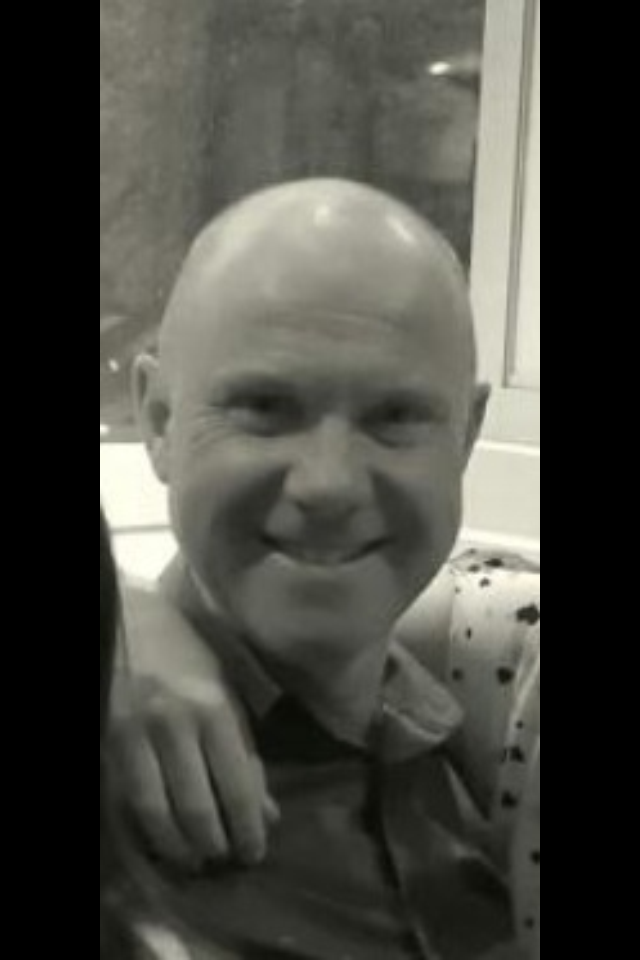
Character: Hugh Green - The protagonist determined to find out the killer of his co-worker and friend - Jack Matthews
I was involved in the filming as my looks, age and build helped convey the character that 'The Unit' production team wanted to portray. The character also appeared interesting and I wanted to over come the challenge set to me.

Background Music and Sound Effects

We choose this as a draft or starting point for background music as it is calming however it still builds tension slowly for the audience by the use of the piano. We also think that we could put sound effects over the backing track because the music itself is not over developed and complex so it wont be too manic for an opening sequence.

We also have chosen the piece of canon music as it sounds a more realistic Gun shot rather than the actual hand gun sound effects. The sound also has a steady continuous after effect of the shot which makes it more dramatic and we would like to put it in the first 30 seconds of the opening sequence before the audience is visually introduced to the opening sequence.


Thursday, 22 January 2015
Order of Titles
In class we discussed the order we would expect to view the names of the production team and actors within our film. To plan this we studied another film opening and noted the order and appearance of their opening titles and credits in order to correctly complete ours.


Subscribe to:
Comments (Atom)